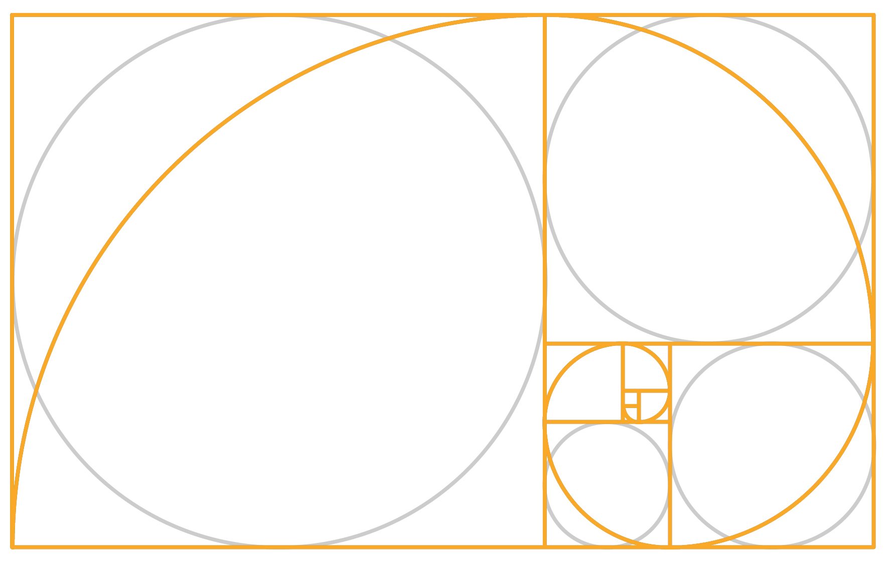
The golden ratio logo leverages the mathematical concept of the golden ratio (approximately 1.618), a proportion often found in nature, art, and architecture. This ratio is represented by dividing a line into two parts, such that the whole length divided by the longer part is equal to the longer part divided by the shorter part. In design, this principle is used to create visually harmonious and balanced shapes.

Golden ratio logos are structured using circles, rectangles, or spirals based on this proportion, ensuring that every element feels naturally aligned and proportionate. Famous logos like Apple, Twitter, National Geographic, Google (G), Toyota and Pepsi have incorporated the golden ratio subtly, contributing to their iconic status.
Benefits of Golden Ratio Logos:
Aesthetic Appeal: The natural balance of the golden ratio makes designs inherently pleasing to the human eye, fostering a positive first impression.
Timeless Design: Logos based on this principle tend to feel classic and enduring, resisting trends and remaining relevant over time.
Brand Recognition: The visual harmony improves memorability, helping your brand stand out in a crowded marketplace.
Professionalism: A well-structured logo signals attention to detail, enhancing your brand’s credibility.
Using the golden ratio in logo design creates a strong visual identity that resonates with audiences, enhancing brand perception.
 _ $
_ $
 _ ₹
_ ₹